True-to-device viewports
Pages render at each device's exact width, so layouts wrap, break and reflow exactly as they do in real life — with live pixel readouts.
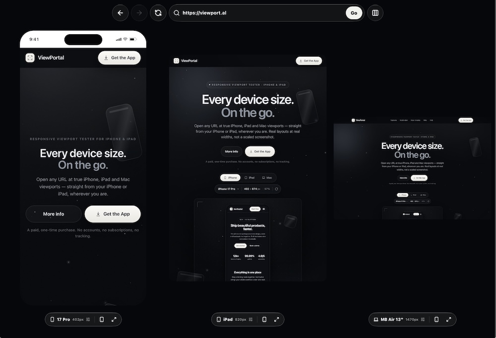
Open any URL at true iPhone, iPad and Mac viewports — straight from your iPhone or iPad, wherever you are. Real layouts at real widths, not a scaled screenshot.
A paid, one-time purchase. No accounts, no subscriptions, no tracking.
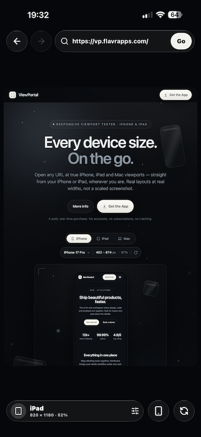
Tap a device — the page reflows at that exact width, just like in the app. ← → to switch.
Everything you need to check a layout across every screen — without a laptop in reach.
Pages render at each device's exact width, so layouts wrap, break and reflow exactly as they do in real life — with live pixel readouts.
iPhone SE through 17 Pro Max, iPad mini to Pro 13", and six Macs from MacBook to iMac 24" — presets ready to go.
On iPad in landscape, place phone, tablet and desktop next to each other. Every pane loads the same URL — configure each independently.
Crisp pinch-to-zoom, exactly like a real browser. Flip any device between portrait and landscape to test both ways.
Point ViewPortal at localhost or a 192.168.x.x dev server — or reach your always-on home Mac from anywhere over Tailscale. Catch breakpoint bugs before you ship, wherever you are.
No accounts, no analytics, no tracking. URLs, favourites and preferences stay on your device and are never transmitted.
The hero feature. On iPad in landscape, line up every screen size side by side and watch the same page render at three true widths simultaneously.
Coding from your iPhone? Confirm a desktop layout, reproduce a bug report, or check an AI agent's change at true device widths — no laptop required.
ViewPortal loads any URL in a real browser engine and forces the page's layout viewport to each device's exact width — so media queries and breakpoints fire correctly. What you see is what your visitors get.
Any public site, or your own localhost / LAN dev server.
Choose from iPhone, iPad and Mac presets — and rotate to taste.
The page reflows at the true width, with the exact pixel size shown.
I'm increasingly coding from my phone — prompting AI agents to make changes while I'm on the go.
I kept wanting to check how a desktop-sized layout looked, confirm an agent's change was right, or reproduce a bug report across every device size — without a laptop in reach.
ViewPortal is the tool I wanted: open any URL and see it at true iPhone, iPad and Mac viewports, straight from your iPhone.
innerWidth and media queries fire correctly — not a scaled-down screenshot. The live readout shows the precise pixel dimensions you're testing.localhost or a 192.168.x.x address to preview work in progress and catch breakpoint bugs before you ship. Local network access is requested only for previewing your own dev servers.ViewPortal is coming soon to the App Store for iPhone and iPad. A paid, one-time purchase — no accounts, no subscriptions, no tracking.
Coming soon to the App Store